Something is brewing in the interest rate market…
And, this Wednesday, the pressure may blow the lid off several markets as a result.
Because underneath it all, the inner plumbing of the entire economy is all about interest rates.
Before I get into what’s happening – and show a simple way traders can improve their game – let’s address a very common misunderstanding about interest rates:
- The interest rate market is not a single measure
- Inflation does not mean that all interest rates rise
Even the most seasoned traders make this mistake.
To start things off, here’s a summary of a recent conversation I had with a 35-year Wall Street veteran:
Me: Hey, the 30-year rate is toppy, I think it’ll come back down into a range.
Wall St. Veteran: How?! Inflation is only going up!
As we’ve seen this year, even when inflation is on the rise, certain types of interest rates can still fall. But the best way to show you the disconnect of the conversation is in the chart below.
It shows two types of interest rates, the yield on 30-year Treasury bonds (black line) and the yield on 30-year TIPS (Treasury Inflation-Protected Securities) or what’s known as the breakeven inflation rate (red line). The difference between the two is seen in the dark grey shaded portion.

We can see that these two rates are not the same. The inflation rate (TIPS) has been rising, while the rate on Treasury bonds has been falling.
The difference between these is what’s known as the real rate – it measures how much inflation is rising relative to the 30-year Treasury bond.
Right now it’s in negative territory, and the lower it gets the more troubling it is.
That’s because when it comes to the economy as a whole, think of the inflation rate as the cost of doing business and the treasury rate as your revenue. Right now, our “expenses” are outpacing our “revenue” on a macro scale.
To take it a step further, interest rates have different maturities… and all of them combine to form the yield curve.
The shape of this yield curve is also telling. Here’s what I mean…
In a normal functioning economy, the longer out you go on the rate curve, the higher interest rates should be. And the better the economy performs, the steeper the yield curve should get.
One of the biggest reasons for this is the way the lending market works and how banks make money. When banks or other lenders issue loans, they borrow short-term and then lend long term… thereby pocketing the difference.
But, when the shape of that curve flattens, their willingness to make loans declines – making them more discerning lenders… And they start to take less risk, resulting in less loans and less action in the economy.
Take a look at this curve now versus where it was earlier in the year…
Investors can pick any short-term maturity and compare it to a longer-term one. This chart shows the 2- year versus the 10-year spread since it’s the most popular proxy…

This measure rallied coming out of 2020. However, it’s been declining since February.
If you recall, February was also when a lot of the high growth hype names topped out. The ARK Innovation (ARKK) fund is a good example… it hasn’t recovered since. That’s not a coincidence.
Moreover, the long-term trend in this chart is declining. That’s why some economists say the inflation we’re seeing now is just “transitory” and still not at alarming levels.
And it’s why the Fed isn’t doing anything about it – not yet anyway. They want inflation to run hot, hoping it will kickstart the growth they’ve been looking for since 2009 and change the trend of this chart.
|
Free Trading Resources Have you checked out Jeff’s free trading resources on his website? It contains a selection of special reports, training videos, and a full trading glossary to help kickstart your trading career – at zero cost to you. Just click here to check it out. |
But the chart that really worries me is the divergence between the volatility of the bond market and stocks…
Regular Market Minute readers are familiar with a popular measure of stock market volatility called the Volatility Index (VIX), but the interest rate market also has a measure of volatility called the Merrill Lynch Option Volatility Estimate (MOVE) index.
Take a look at this chart…
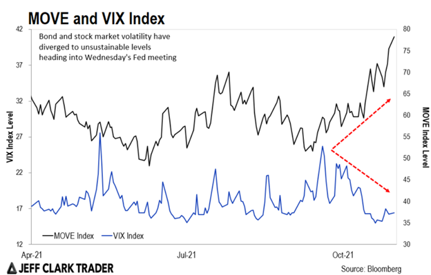
As Jeff Clark mentioned last week, the Fed will likely unveil the timing of their bond tapering program this Wednesday…
Based on this chart, one of three things can happen:
- The VIX jumps from current levels (which means stocks fall hard)
- MOVE declines (which means bonds rise and interest rates fall) or
- A combination of both
One way or another, this will get sorted out, and I imagine soon… but the status quo on this chart is unsustainable. That’s because these types of patterns are known as “alligator jaws,” and as the saying goes, “alligator jaws always close.”
So, as we head into an important policy meeting from the Fed this Wednesday, traders should have both types of interest rates on their watchlists, and across maturities.
If you want to see where the market is heading next, starting off with the interest rate market is a good bet… and keep ETFs like the iShares 20 Plus Year Treasury Bond ETF (TLT) and the iShares TIPS Bond ETF (TIP) on your watchlist.
Regards,
Eric Shamilov
Contributing Editor, Market Minute
Reader Mailbag
What’s your prediction on what the Fed will decide on during Wednesday’s FOMC meeting?
Let us know your thoughts – and any questions you have – at [email protected].