“It’s hard to find something new to say when nothing new happens.”
That was my 15-year-old son’s response to me when I asked him “What’s new?” after I hadn’t seen him for a week.
Such is the life of a teenager approaching the end of summer vacation. The doldrums are setting in. After several days of inactivity, my son is getting restless for some action.
Me too.
I haven’t done much trading over the past two weeks. The S&P 500 has been stuck in an eight-point range. The Dow Jones Industrial Average has managed to make new highs. But, it has been a series of small, incremental moves – not the sort of rocket-blast rally that creates rapid-fire trading conditions.
And as I performed my weekly chart review this past Saturday morning – where I scour through about 750-800 charts trying to find interesting setups for the coming week – I kept repeating the words of my son…
“It’s hard to find something new when nothing new happens.”
Most charts are a mess. They don’t offer any discernible, low-risk trading patterns. Most technical indicators are in neutral territory – not giving an edge to either side.
Indeed, the one chart that really stood out to me is the same chart that has stood out for most of the past three months. It’s the weekly chart of the iShares iBoxx High Yield Corporate Bond Fund (HYG). I’ve shared it with you a couple of times before – along with the warning that when this chart finally does break down, we can expect the stock market to weaken as well.
This time, though, I added a new indicator.
Take a look…
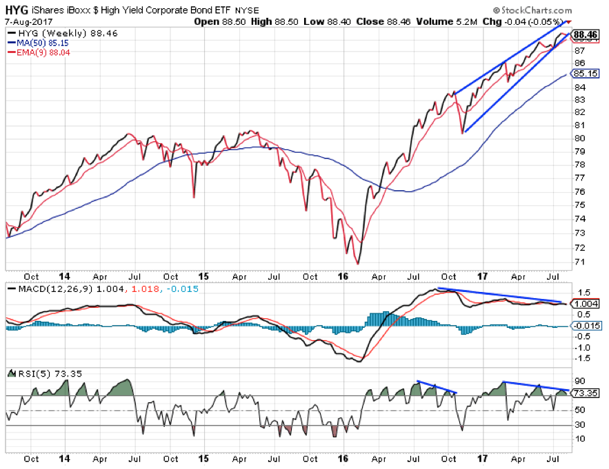
This is a MASSIVE bearish rising wedge formation with negative divergence on the MACD momentum indicator. You’ll recall that negative divergence forms when a chart rallies to higher highs while the technical indicators form lower highs. It’s often an early warning sign that an uptrend is coming to an end.
On this chart, I’ve added the five-week Relative Strength Index (RSI). This is another technical indicator that helps evaluate the strength of a trend. While junk bonds have been trending higher all year, the RSI peaked back in March. It has formed two lower highs since then.
The RSI showed similar negative divergence from last July through October. That action preceded a 5% decline in HYG in November – which occurred at about the same time as the S&P 500 sold off about 4%.
So, even though there’s nothing new in the price action of HYG from when I wrote about it last month (and the month before that), traders should still keep an eye on the chart.
If/when it breaks down, the targeted move is all the way down to the 50-week moving average line at about $85.15. That should be enough to incite a fairly decent selloff in the broad stock market as well.
Best regards and good trading,

Jeff Clark
P.S. How have you been trading in this static market environment? Send me your responses, along with any other questions or ideas, right here.