It’s time to break out the Pain Chart again.
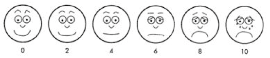
You’ve probably seen it before – if you’ve ever been in a hospital, or if you’ve been reading Market Minute for a stretch of time. The Pain Chart shows a series of faces ranging from happy to sad.
Here’s what it looks like…
If you’re in a hospital, the nurse will ask “How are you feeling?”
You just point to the face that best represents your pain level, and the nurse drugs you up accordingly. It’s a simple, yet very effective way to make sure we get the right amount of medicine. If you’re uncomfortable, you just point to one of the frowny faces on the chart and the nurse increases your dosage.
On the other hand, if you’re giddy beyond belief and you point to the super-grin smiley face, the nurse can cut you off completely.
Investors can use the exact same chart. After all, what better way is there to gauge your proper exposure to the stock market?
We all know the best time to buy stocks is when there’s panic… when investors are suffering the most pain. And we all know the best time to sell is when mom and pop are grinning ear to ear because of the huge gains in their stock portfolio.
A financial advisor could instruct any client, “Please point to the face on the chart that best represents how you feel about the stock market right now.” If the client points to a frowny face, the advisor knows it’s a good time to increase that client’s dosage of stocks.
I’ll bet that by the time the stock market opens this morning, most investors are going to be pointing to one of the frowny faces on the chart. Friday’s market action was ugly. Personally, even though I’ve been sitting on a much higher cash position than usual, I was still pointing to a “6” on this chart by Friday afternoon.
S&P 500 futures gapped nearly 40 points lower when they opened for trading Sunday night. If that holds until this morning, then I’ll probably be pointing to the “8.” That means I’ll be looking to buy into a decline.
Let’s be smart about it, though.
A decline today means the S&P 500 will be breaking down from the chart pattern I showed you last Wednesday and on Saturday. The downside target for that breakdown is the May low at about 2750.
That doesn’t mean we have to fall that far. But traders should be prepared for a move to that level.
As conditions get oversold – as the proverbial rubber band stretches to the downside – traders should be putting money to work. The simplest way to do that is to decide how much money you’re going to add to the market, divide it by three, and then pick the three levels at which you’ll be buying stocks.
For me, I’ll be looking to buy into the S&P 500 at 2810, 2770, and 2740.
Then, if the market does indeed turn around, if the rubber band snaps back from oversold conditions as it did back in May and December, I’ll likely be pointing to one of the smiley faces on the Pain Chart.
That’s when it will be time to sell.
Best regards and good trading,

Jeff Clark