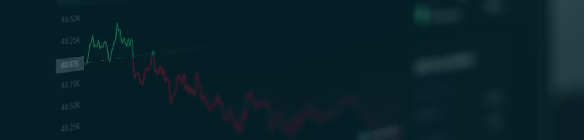
The Volatility Index (VIX) finally popped higher yesterday.
That’s a good thing, because I was getting tired wiping the egg off my face each day this week when volatility didn’t budge.
It’s also a good thing because it will help me to explain why traders should look at charts from different time frames.
But before we get to that explanation, please allow me to restate something about technical analysis (TA) and the art of chart reading…
Short-term price movements in the stock market are based more on investors’ emotions than on fundamental factors. Charts are simply pictures of those emotions. And since human emotions are fairly consistent, traders can use charts to study how investors have reacted to similar conditions in the past and then use that information to project what is likely to happen in the future.
TA is not a science. There are no absolute rules.
Instead, it’s an art. It’s subject to interpretation. And that interpretation is often based on one’s own familiarity with the “emotions” of a particular stock or index, and the ability to recognize “repressed” emotions.
I am not an expert in technical analysis. I’ve never taken a class on it. I don’t have any fancy certification or degree. And I couldn’t tell you how most technical indicators are calculated without first consulting a TA glossary.
But, having been raised in a strict Catholic household, I am an expert in repressed emotions. And that’s where I find value in looking at charts over different time frames.
Let me explain…
Here in the Market Minute, we show many stock charts along with their MACD and RSI indicators. That’s because, for the past couple of years, many stocks have displayed consistent patterns of how they trade based on the movements and levels of those indicators. But that’s not necessarily true of the VIX.
On Monday, we looked at the daily chart of the VIX along with the MACD histogram. For the past year or so, the MACD histogram has had a more consistent trading pattern with the VIX than the MACD or RSI indicators. And, based on that pattern, we surmised the VIX was poised to pop higher.
Here’s the VIX chart I showed you on Monday…

The positive divergence on the MACD histogram is quite clear on this chart. But, other than that, there is no traditional chart pattern. There’s no “falling wedge,” no “consolidating triangle,” no “head and shoulders,” no “inverted Prussian helmet.” (Okay, I made up that last one.)
So, while this chart hints that the VIX is ready to pop, it doesn’t offer any clues as to the timing of that pop. To get those clues – to try to figure out the repressed emotions – we have to scale down to a shorter-term timeframe – like the 60-minute chart we looked at on Tuesday…

This chart showed a consolidating triangle pattern. And the VIX was approaching the apex of the triangle.
So, we knew the VIX was soon going to break out of this pattern one way or the other. And, based on the positive divergence on the MACD histogram on the daily chart, we figured the odds favored a break out to the upside.
Here’s what happened yesterday morning…

Just as the chart hit the apex of the triangle, the VIX broke out to the upside and we got the “pop” we were looking for.
Traders should always look at a daily chart of a stock or an index to get an idea of the direction of the next move. Then, scale down to the intraday charts to get a better picture of the potential timing of the expected move.
(Note: Most free charting services don’t provide intraday charts. To get that, you’ll have to pay for it. There are many charting services to choose from. For what it’s worth, I use StockCharts.com.)
Does it always work out like it did with the VIX chart above? Of course not.
Like I said before, technical analysis is an art, not a science. But it is an art that can give you an edge in your trading.
Best regards and good trading,

Jeff Clark
P.S. Keep in mind… when trading off of intraday charts, the patterns tend to play out within hours rather than days or weeks. That was certainly the case with the VIX yesterday which opened sharply higher. By the end of the day, though, the VIX closed lower. So, now we have a case where the daily chart of the VIX still looks similar to how it was set up on Monday, but the 60-minute chart has played out and now has no discernible pattern. The 60-minute chart now needs time to reset.
Reader Mailbag
Today, some kind words from a Delta Report subscriber…
You have been the stabilizing guide I needed to make my gains over the past couple of years. Thanks and keep up the good work!
– Kane
Have you used Jeff’s market guidance to book wins recently? Tell us your trading stories – along with any questions or suggestions – right here.