The new Volatility Index (VIX) buy signal is off to a rough start.
All of the major market indexes fell at least 2% on Friday. That’s the biggest one-day loss in about two years. Also, that action capped a week in which the S&P 500 lost 110 points – thereby giving back about half of its gains for the year.
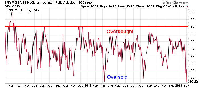
Now though, many technical indicators are at extremely oversold levels. For example, the McClellan Oscillators for the NASDAQ and the NYSE closed at -70 and -90 respectively. Those are the sorts of readings that often occur near short-term bottoms…

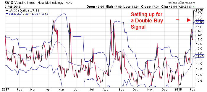
Also, the market’s “fear gauge,” the Volatility Index (the “VIX”), closed Friday at 17.31. That’s well above its upper Bollinger Band. And, it sets the stage for a rare “Double Buy Signal” when the VIX closes back inside its Bollinger Bands.
We now have a much stronger buy signal.
We haven’t seen a VIX double buy signal since July of 2015 – after which the S&P 500 gained almost 4% in less than one week.
So, based on this setup of the VIX, and the oversold condition of the McClellan Oscillators, I’m looking for a fairly decent bounce in the markets this week. But, it’s a short term bounce only.
As I explained last week, the stock market has broken down from a parabolic move. It is likely to give back all of the gains from that move. So, I expect we’ll see the S&P 500 trading closer to 2670 or so before the current correction phase is over.
In the short term, though, we’re poised for a bounce. If the market opens lower today, I’ll be looking to buy.
Best regards and good trading,

Jeff Clark
Reader Mailbag
In the mailbag, one reader takes Jeff to task for suggesting that the bond bubble popped last week…
Breakout”? Not really. This is classic chart tea leaf reading with lines drawn in to suit the desired conclusion. The highs at the end of 1994, at the end of 1999 and in summer 2006 could at the time equally have been seen as a “breakout”, only for the downtrend to resume some time later. There is zero predictive value in this chart.
– Reinhard
Jeff’s Response: Thanks for the feedback, Reinhard. Technical analysis is much more of an art than a science. We can both look at the same chart and draw different conclusions. Only time will tell which opinion is correct.
Let’s take another look at the monthly chart of the ten year Treasury yield, noting your comments about 1994, 1999, and 2006…
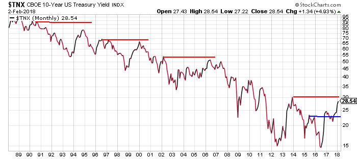
None of the three rallies during the time periods you reference produced a “higher high” on the charts. The yield approached the red resistance lines, but did not break above them.
In my view, the current rise in the ten-year yield formed a higher high in early 2017 when it broke above the blue resistance line. It then pulled back and formed a higher low. And now, it has rallied to another higher high. To me, that constitutes an uptrend.
However, I can also see the argument that yields haven’t really broken out until they can climb above the red resistance line drawn from the 2013 high.
I like my argument better. But, like I said, only time will tell.