Well, it’s about time.
For weeks I’ve been writing about the potential for an upside breakout in the gold sector. On July 18, I showed you that we got a buy signal from the gold stock Bullish Percent Index. And, on Tuesday, I showed you that the smart money had turned bullish on gold and silver. All that was left to fall into place was a breakout in the GDX/Gold ratio chart I showed you earlier this month.
The breakout finally happened. Take a look at this updated chart…
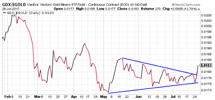
Remember, this ratio compares gold mining stocks from the VanEck Vectors Gold Miners Fund (GDX) to the yellow metal itself. When this chart is moving higher, gold stocks are performing better than the metal. That’s bullish for the gold sector. When it’s moving lower, gold stocks are underperforming gold. Typically, that’s bearish for the gold sector.
This chart peaked back in February at about the same time as gold and gold stocks peaked. For the past three months, this chart has been forming a consolidating triangle pattern -building energy for its next big move.
That move started on Wednesday, and it’s to the upside.
The GDX/Gold ratio chart has busted higher out of its consolidating triangle pattern. This should mark the start of an intermediate term rally phase for the gold sector. Of course, it won’t be a straight up move. But, gold stocks should be higher several weeks from now than where they are today.
We now have three solid technical reasons to own gold stocks: a BPGDM buy signal; a bullish Commitment of Traders setup; and an upside breakout in the GDX/Gold ratio chart.
Traders should view any short-term weakness in the sector as an opportunity to add more exposure to gold and silver stocks.
Best Regards and Good Trading,

Jeff Clark
P.S. The indicators are telling us an intermediate term rally is about to kick off for gold. Are you preparing to take advantage? Drop me a note by clicking right here.