The gold sector is quickly building up energy for a big move.
After breaking down from a potentially bullish setup last week, the VanEck Vectors Gold Miners Fund (GDX) has spent the past few days chopping around in a tight, 60-cent trading range. Here’s an updated look at the 60-minute chart of GDX…

This chart now shows a consolidating triangle pattern, which consists of a series of lower highs and higher lows. The chart is approaching the apex of the triangle. So, GDX is going to break out of this pattern one way or the other sometime soon – either today or Monday.
| Recommended Link | ||
|
||
| — |

The height of the triangle – from the low point to the high point – is 60 cents. So, the initial move from a breakout should be 60 cents as well. That gives us a price target of $23.20 on an upside breakout. The downside price target is $22.
The unique thing about this situation, though, is that either of those moves is likely to set up a buying opportunity in the gold sector. Let me explain…
In last Friday’s Market Minute, I explained last week’s breakdown in the gold sector. I suggested that GDX still had a bit more work to do on the downside, but that it was quickly reaching an exhaustion point – from which it could stage an oversold bounce. Specifically, I wrote…
Traders will know that we’ve reached the exhaustion point when GDX opens 1%-2% lower one day and then reverses to close up on the session.
If GDX breaks to the downside today or Monday, then that’s the action I’ll be looking for before buying into the sector.
On the other hand, if GDX breaks out to the upside, then it’s likely to shift the momentum of the GDX/Gold ratio chart back to bullish. Here’s an updated look at that chart…
This chart compares the action in gold stocks to the action in gold itself. It’s bullish when gold stocks outperform the metal – which is when the chart moves higher. It’s generally bearish when gold stocks underperform the metal, and the chart moves lower.
In order to be confident that we’ve started a new rally in the gold sector, this chart needs to break above the blue resistance line. That can happen quickly if the previous chart of GDX breaks its consolidating triangle pattern to the upside.
So, either way, it looks like we’re approaching another good time to buy into the gold sector. And it could happen as early as Monday.
Best regards and good trading,

Jeff Clark
P.S. Last night, my colleague and cryptocurrency expert Teeka Tiwari hosted a special cryptocurrency briefing called the $1 Million Dollar Bitcoin Giveaway. Over 250,000 people registered in advance to watch. That’s the most I’ve ever seen for a live event.
I understand that thousands of people who wanted to attend this special event couldn’t. So, the Palm Beach Research Group is making a replay available for a limited time.
If you missed last night’s showing, you can watch the replay – and still learn how to claim a portion of the $1 million in bitcoin – right here.
Reader Mailbag
In today’s mailbag, a reader identifies one of Jeff’s tried-and-true chart patterns.
But first…
I was examining the Portfolio to assess things, and noticed the expiration of some holdings had the incorrect year (1970)…an easy fix.
– Patricia
Editor’s response: Thanks for the heads-up, Patricia. This bug was the result of the portfolio treating some of our stock holdings like option trades… Without an expiration date, the portfolio generated 1970 as a kind of “default” date for the stocks. It’s now corrected.
I have been a subscriber of yours for many years starting at Stansberry, and I have learned a lot from you! Thanks!
I recognized today, however, one of your favorite patterns in silver – ascending wedge with negative MACD divergence. So I am worried that we might be in for a tough period in the precious metals and gold stocks…
– Abrahm
Jeff’s response: Hi Abrahm. Let’s take a look at the chart of silver…
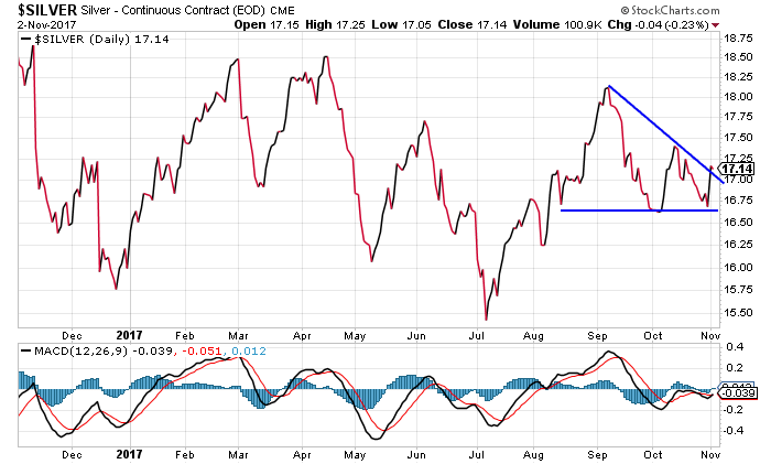
This isn’t perfect, but I can see where you can draw a “descending triangle” pattern (which is what I think you were referring to). This is a bearish pattern that consists of a series of lower highs that form the resistance line, and a series of similar lows for support.
The pattern takes on more significance if it also has a strong negative pattern on technical indicators such as the MACD.
But, that’s not what we have here. There’s no negative divergence on the MACD. That can only occur as a stock is making higher highs while the MACD makes lower highs.
In fact, we might argue that the MACD has some modest positive divergence since the MACD was holding at a higher level when silver was hitting the support line earlier this week.
The bottom line is, I don’t necessarily think we have a bullish pattern here, but I don’t think it’s all that bearish either.
What do you see coming for the precious metals market? Have you made any past gold or silver trades in this kind of market environment?
Send in your trading stories… and any questions or suggestions… right here.