Mountain climbers refer to the “death zone” as any altitude above the point where there isn’t enough oxygen to sustain human life.
This level typically comes in around 26,000 feet. So, if a climber stays at that altitude too long…
Well, it’s not called the death zone for nothing…
Financial markets aren’t all that different.
Many markets have their own death zones – price levels where there’s been a historically high chance of a trend reversal.
And right now, the U.S. dollar is trading just inside its death zone.
And while this might be bad for dollar bulls, it’s likely going to be good for assets that move counter to the dollar, such as gold, silver, and other commodities.
Another beneficiary of a weaker dollar would be foreign currencies that are reliant on commodity exports.
|
Free Trading Resources Have you checked out Jeff’s free trading resources on his website? It contains a selection of special reports, training videos, and a full trading glossary to help kickstart your trading career – at zero cost to you. Just click here to check it out. |
Some examples of such currencies would include the Australian and Canadian dollars. Both these economies are dependent on commodity exports and would benefit from a weakening greenback.
That’s why it pays for investors to keep a close eye on what the dollar is doing.
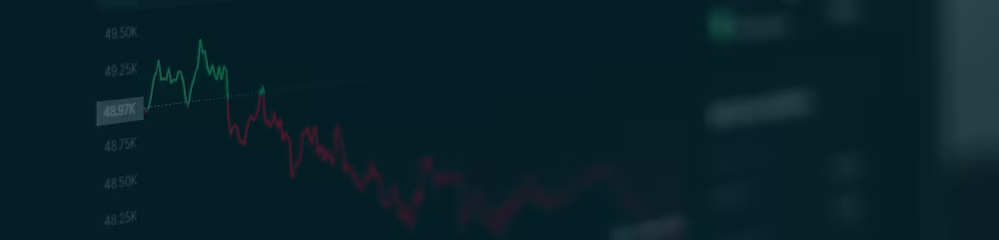
With that in mind, let’s now check out a two-day chart of the dollar index (DXY)…

Here’s what’s going on with this chart:
-
DXY sold off more than 8% the last time it traded around current levels. That was back in June 2020.
-
The Bollinger Bands (blue shaded area between the lines) tell us the dollar’s rally is now extreme. Trading outside the upper band is a signal of the dollar’s overextended condition.
-
The Relative Strength Indicator (RSI) at the bottom of the chart is signaling a bearish divergence (blue line marked 3). Divergence occurs when prices make a new high, but the indicator fails to do the same.
For example, you can see how DXY made a new high, and so did the RSI back in November. DXY made another new high this time around, but the RSI couldn’t.
It’s no secret that the Fed was going to take a more hawkish tone to tame inflation.
This has led to the market pricing in a more valuable dollar, which it has done over the last year.
From here, sure, the dollar could go a bit higher… but it would have to fight a lot of technical resistance every step of the way.
The fact is the technical evidence suggests the current rally is close to exhaustion (as I explained with the chart above). A turn in this market is right around the corner.
In short, all this tells me the next big move for the buck is likely to be lower, not higher.
Happy trading,
Imre Gams
Analyst, Market Minute
Reader Mailbag
In today’s mailbag, The Breakout Alert member Xiping shares his thoughts on the S&P 500…
I’m also watching the VIX all the time and agreed with Jeff’s idea of buying last week. I bought more than 10 stocks, made most of my cash working, and I still have a couple of stocks on my buy list and will do it early this week. I believe the S&P 500 is on the way to 5500.
– Xiping M.
And, Jeff Clark Trader member Gary thanks Jeff…
Jeff, I’ve been following you for a few years and really appreciate your consistent daily (and sometimes multiple a day) communication. They’re very helpful.
I sure hope you’re right about last week’s close within the Bollinger Bands with this last update. The bottom line is I wanted to express my appreciation for your consistent work. Thank you very much!
– Gary R.
Thank you, as always, for your thoughtful comments. We look forward to reading them every day. Keep them coming at [email protected].