The first gold stock buy signal of 2017 is working just fine so far. And there are bigger gains ahead.
Two weeks ago, the Bullish Percent Index (BPI) for the gold sector turned higher from oversold conditions and generated its first buy signal of the year. Since then, the gold sector – as measured by the VanEck Vectors Gold Miners Fund (GDX) – has rallied a little less than 3%.
Now, to me, a 3% gain in two weeks is a pretty good start for a new uptrend. But I’ve received comments from several readers who are frustrated at how “painfully slow” it has been for this Gold Miners Bullish Percent Index (BPGDM) buy signal to pay off.
So, for today, let’s delve a little deeper into the BPGDM so we can get a better idea of how it works and what to expect from its signals.
Recall from my previous essay on this subject that a BPI indicates the percentage of stocks in a sector trading with bullish “point and figure” chart patterns. Don’t worry about what a point and figure chart is. All we’re concerned about is what percentage of the sector is trading with bullish patterns. And that’s what the BPI shows.
Since it’s a percentage, the BPI can range from zero to 100. The lower the number, the more oversold the sector is. So, if a BPI hits zero, then the sector is at its most oversold level possible according to this indicator.
The higher the BPI, the more overbought a sector is. A reading of 100 would indicate the most overbought level possible.
In general terms, a sector is oversold when the BPI drops below 30. It’s overbought when it rallies above 80. (Note: Some technicians use 70 to indicate overbought levels, but over the years I’ve found that 80 is a more reliable measure.)
But just being oversold or overbought is not enough to generate buy and sell signals. The BPI needs to turn higher from oversold conditions to generate a buy signal. It needs to turn lower from overbought conditions in order to trigger a sell signal.
Take a look at this chart of the Gold Miners Bullish Percent Index (BPGDM)…
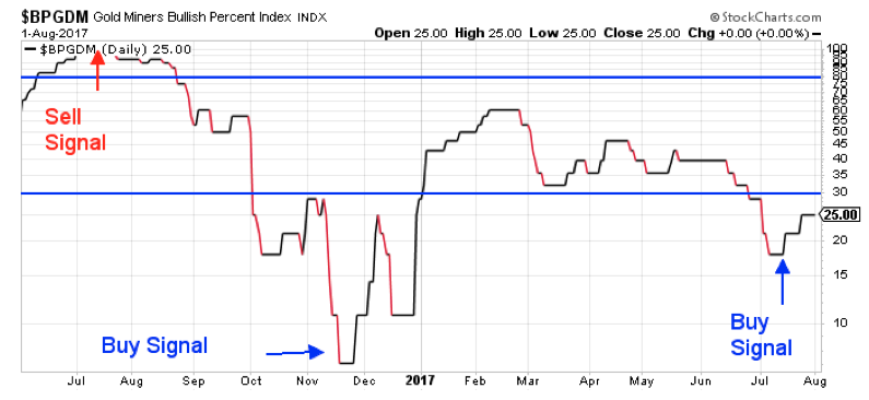
Last July, the BPGDM rallied above 97. That means that 97% of the stocks that make up the BPGDM were trading with bullish chart patterns. That’s just about as high and as overbought as this indicator can get. When the BPGDM turned down from that level, it generated a sell signal.
For traders, I recommended trimming gold stock holdings and buying put options on a couple of gold and silver stocks.
Now, just to be clear, I don’t use the BPI on its own to make trading decisions. But I do give this indicator plenty of weight when it lines up with other conditions (like the Commitment of Traders report, and various technical patterns and indicators).
Fast forward to November of last year when the BPGDM traded at 3 – meaning only 3% of the stocks in the index had bullish chart patterns. That’s just about as oversold as this indicator can get. When the BPGDM turned higher in late November, I told subscribers it was time to get aggressively long the gold sector. We executed four trades.
All were profitable. All returned anywhere from 21% to 30% in six weeks or less.
Take a look at how GDX responded to last year’s sell and buy signals…

BPI buy and sell signals don’t always mark the absolute lows and highs for the sector – but they get close.
Following the sell signal last July, GDX rallied even higher in August. But by October, anyone who sold their gold stocks based on the BPGDM sell signal had to be pleased.
Similarly, it took several days last December before the BPGDM buy signal kicked gold stocks into gear. But once the rally got going, GDX gained 30% in just over six weeks.
So, now we have a new BPGDM buy signal. GDX is “only” up 3% in response. But notice that the BPGDM is still only at about 25. There’s a whole bunch of room left for it to go higher. And, if this signal plays out like past buy signals, it’s going to be running higher for several weeks.
Best regards and good trading,

Jeff Clark
P.S. Just about every charting service can chart the Bullish Percent Indexes. I use StockCharts. But other services – including probably your own brokerage firm – should be able to produce similar charts. The symbols may not be the same. So, you’ll have to search for “bullish percent index.” And you may have to pick up the phone and speak to someone for help.
Mailbag
For today, here’s a note that came in recently from one of my Delta Report subscribers… And remember, if you have any questions or comments about trading options or using any of my services, drop me a line right here.
Just a quick note of appreciation to let you know that out of all the analysts Stansberry has parted ways with (and there have been a few over the years), you are the only one that I have subscribed to in addition to the Flex membership I have over there. I never thought I'd shell out more money for extra subscriptions being as though I'm a small investor, but I could not do without your prescient market commentaries every day, your awesome trades and your restraint/choosiness (only trades Mother would make). Like that regular cup of coffee in the morning. You respect your subscribers greatly and it is very much appreciated.
With that said, I have almost paid for my LIFETIME membership with two killer trades in about three months. QCOM calls bought at $0.91 and again at $0.84 then sold for $2.55. Then, just recently (and an awesome call I might add) TGT puts sold at $1.95 then I had set up a trade before going to work to buy back at $0.60 not knowing you would send out a note to buy back at $0.56! I'm even starting to think like you now I've been following you for so long. Then there's CCJ… keep them coming… this is better than Christmas!
– James